Paper cut #02 · The list that scrolls away
Your AI hands users a plan, then lets them lose it
When a reply is a list of things to work through, it’s the plan. The interface treats it as text, and items get quietly dropped.
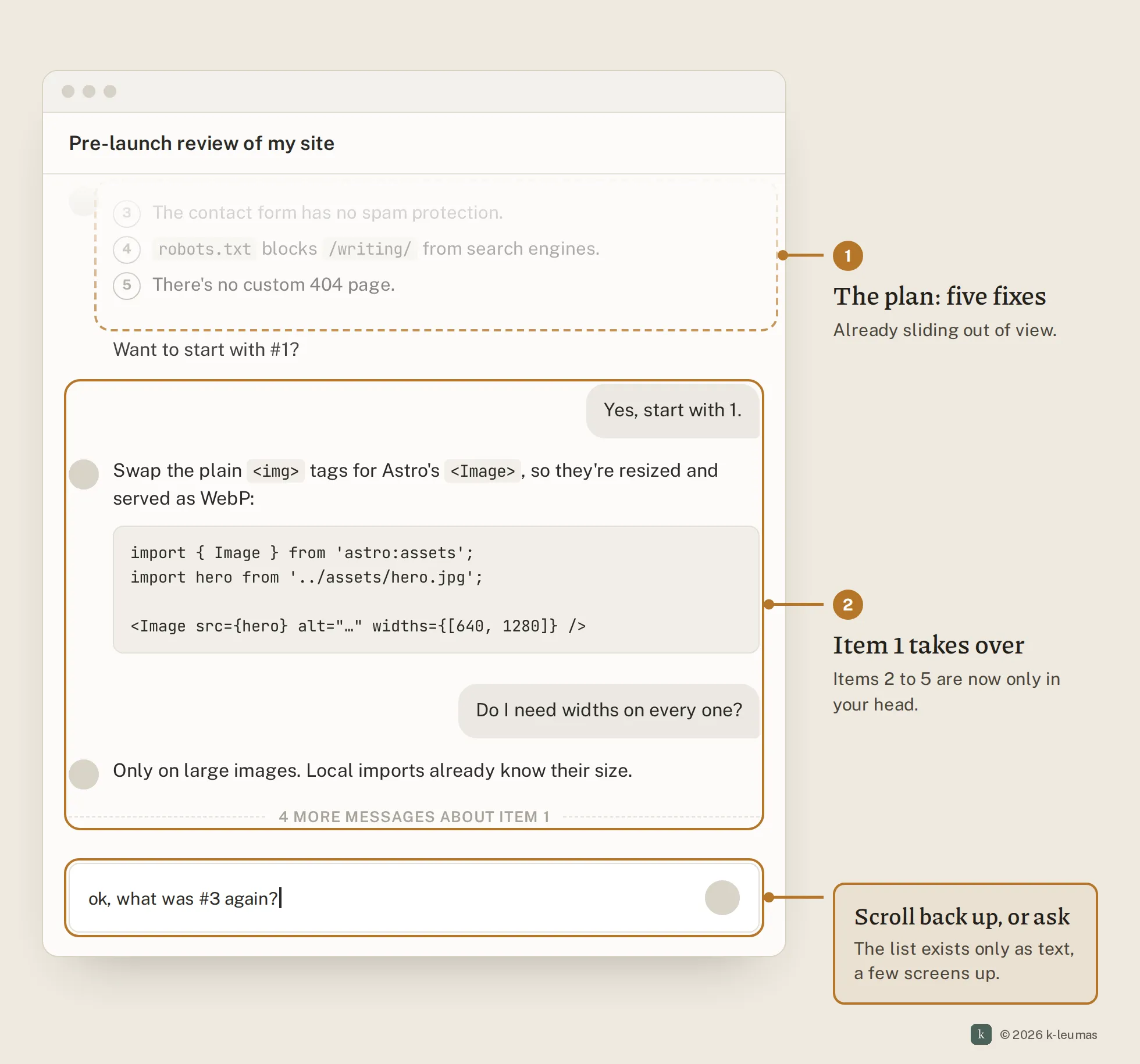
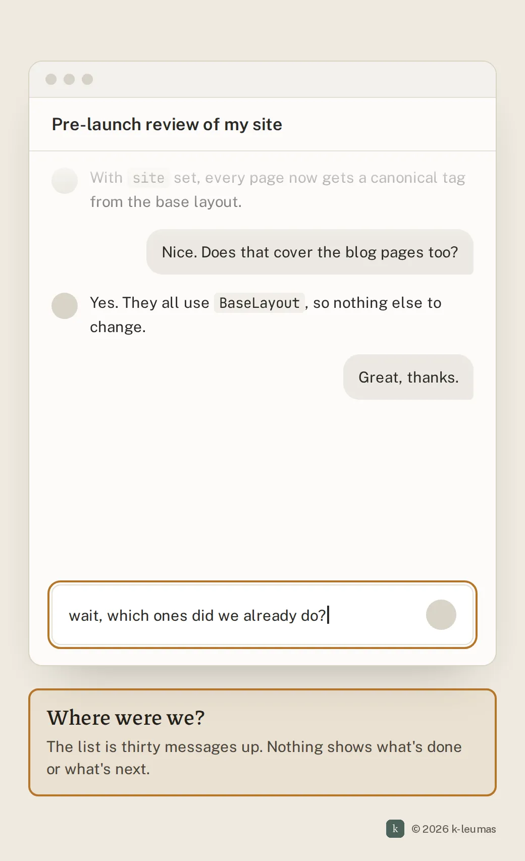
You ask for a review of your setup and get back five numbered issues. Good answer. You start on the first one, and a few messages later the list is a screen and a half above you.
Now you want to get to number three. You scroll up to reread it, scroll back down to type, and write “for #3…” and hope the model knows which list you mean. By the time you’re done, you’re not sure whether you ever came back to number four.
What happens today
- You ask something broad, and the reply is a numbered list: questions for you to answer, issues to fix, steps to work through.
- You pick one item and start on it. The replies pile up below, and the list scrolls out of view.
- To pick up the next item you scroll back up, find it, and scroll down again. Or you copy the list into a notes app so you can see it, or ask the model to turn it into a tracker that lives somewhere other than the thread.
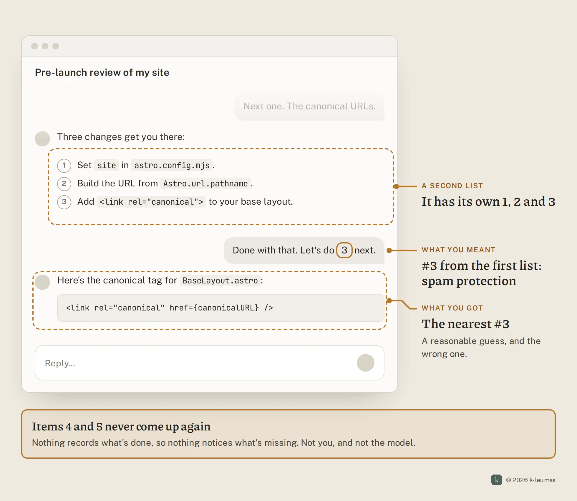
- You refer to items by number, but there’s no way to point at one. Later replies often bring numbered lists of their own, so “3” can mean two different things.
- The list keeps changing as you go. The model adds follow-up items, and one answer splits into two new questions. None of that shows up in the original list.
- Nothing tracks what’s done. An item can quietly drop, and neither you nor the model notices until it matters.
Why it stays broken
The list only exists as formatting. To the interface, a reply that sets out five things to work through looks exactly like a reply that explains one thing in five paragraphs. It renders them the same way, and it lets them scroll away the same way.
- What the user optimises for: getting through the current item. Keeping the whole list in view is overhead, so people carry it in their heads, or scroll back up for it, or paste it somewhere else.
- What the system pays for it: dropped items, repeated questions, and answers aimed at the wrong list. The model ends up rereading the whole thread to work out what “#3” meant and whether it’s been dealt with.
- Why nobody feels it in the moment: a dropped item leaves nothing behind. You don’t find out that question four never got answered until something breaks because of it.
Some tools already have the panel. Claude now shows a checklist beside the conversation when it’s doing multi-step work, and ticks items off as it goes. But that list tracks the model’s work. When the list is work for the user, it’s still just formatting.
The list was the plan for the next stretch of the conversation. The interface throws the plan away and leaves the user to remember it.
A fix
Let a list stay in view while you work through it, and let the interface keep track of progress.
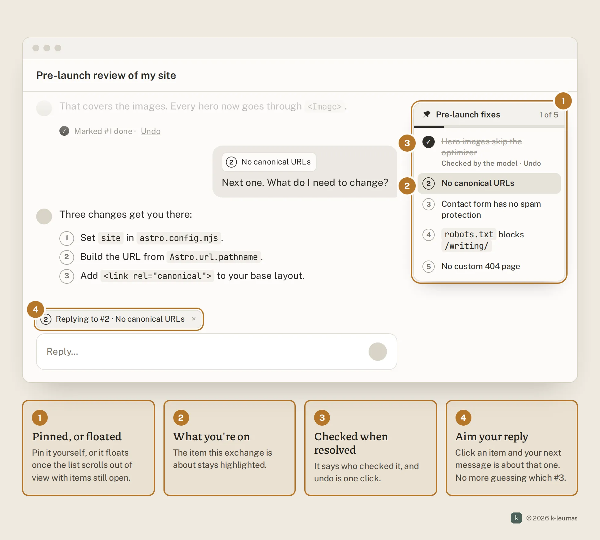
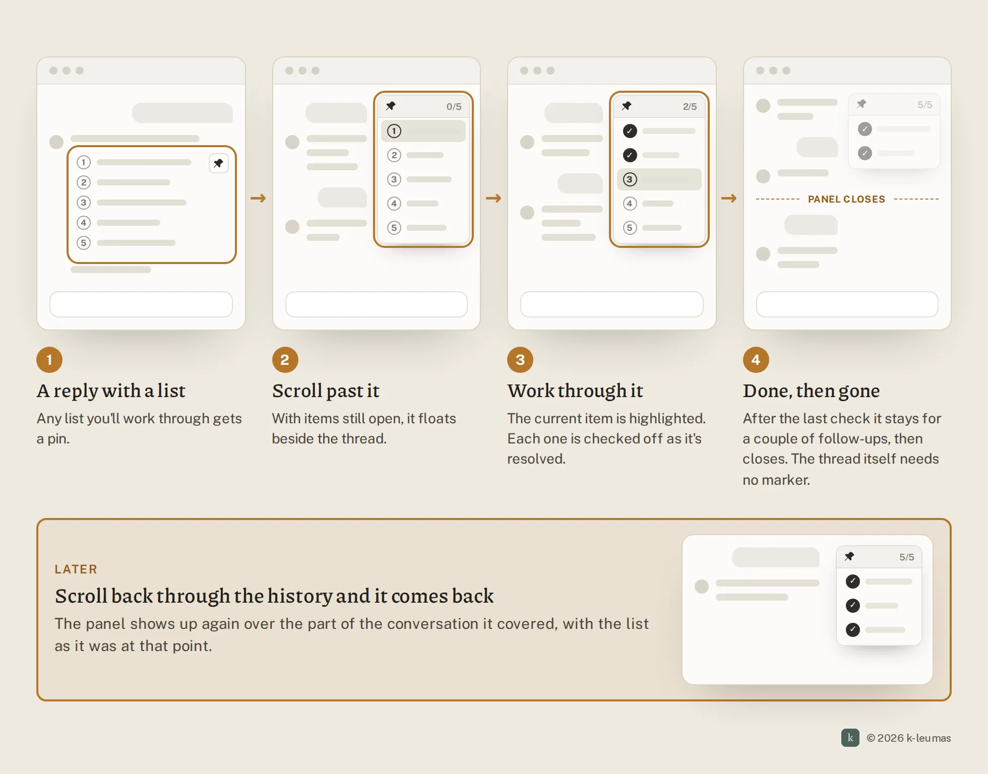
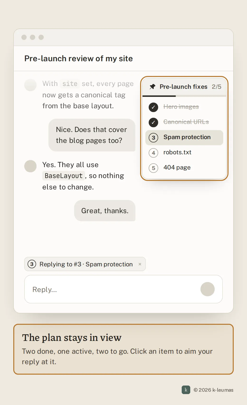
Pin it, or let it float. Any numbered list in a reply gets a small pin control. Pinning it moves the list into a floating panel beside the conversation. If you don’t pin it, it floats on its own anyway: once you scroll past a list that still has open items, it turns into the panel.
It tracks where you are. The panel highlights the item the current exchange is about, and checks it off once it’s resolved. Clicking an item points your next message at it, so “this one” always means the right one, whatever numbers appear later in the thread.
It knows when you’re done. When every item is checked off, the panel goes away. That end doesn’t have to be marked in the conversation, and it shouldn’t be abrupt. People often ask a follow-up or two after the last item, so the list’s span runs a few messages past completion before the panel closes.
It comes back with the history. Scroll back up through that part of the conversation later and the panel reappears, showing the list as it was at that point. The conversation’s structure stays visible when you come back to it.
Side by side
How you’d build it
- Smallest version: a pin control on any rendered ordered list, which puts it into a sticky side panel. You check items off yourself. This is front-end only, with no model involvement, and it already solves the scrolling problem.
- Solid version: the model marks a list as actionable when it writes one, and gives each item a stable ID. On each later turn it reports which item it’s addressing and whether that item is resolved, so the panel can highlight and check items automatically. Clicking an item attaches that item’s ID to your next message. Lists with open items float on their own once they scroll out of view.
- Ambitious version: lists become part of the conversation’s state. Items can be added or split by later messages, so a list can keep growing while you work through it. Completion closes the list’s span, a few messages after the last check. Spans are stored, so scrolling back through history shows each list as it stood at that point, and a thread can hold more than one.
Trade-offs to watch: a wrong checkmark is worse than none, so auto-checks have to be easy to undo, and it has to be obvious that the model made them. Not every numbered list is work. Ranked options, a recipe or a list of facts shouldn’t follow you around, so auto-float should only apply to lists that ask something of the user. On a phone, a side panel takes too much room, so it collapses to a chip like “2 of 5 open.” Measure how often people undo an auto-check, and how many items are still open when a panel closes.
Audit your own product
- When a reply lists things for the user to work through, can they keep that list in view while they do it?
- Can users point at a specific item in an earlier reply, rather than describing it or quoting its number?
- Does your product know the difference between a list of things to work through and a list that’s just formatting?
- Can the user or the system tell which items are done and which were skipped?
- If the list changes over the conversation, does anything reflect that?
- When someone scrolls back through a long thread, can they see how it was organised, or just a wall of messages?
A lot of what people do with these tools isn’t one question and one answer. It’s a short project: a set of things to check, decide or fix, worked through over twenty messages. The model already plans that work when it writes the list. The interface should keep the plan in view until the work is finished.