Paper cut #01: The kitchen sink conversation
Chat-first LLM tools make staying in one long conversation easier than starting a new one, so users do, and the model quietly gets worse at helping them.
It starts with a bug. Twenty minutes later you’re asking about a deploy config, then a regex, then how to word an email to a client. It’s all one conversation, because that’s where your cursor already was.
A day later you want the regex back. It’s somewhere in a thread titled after the bug, between two things that have nothing to do with it.
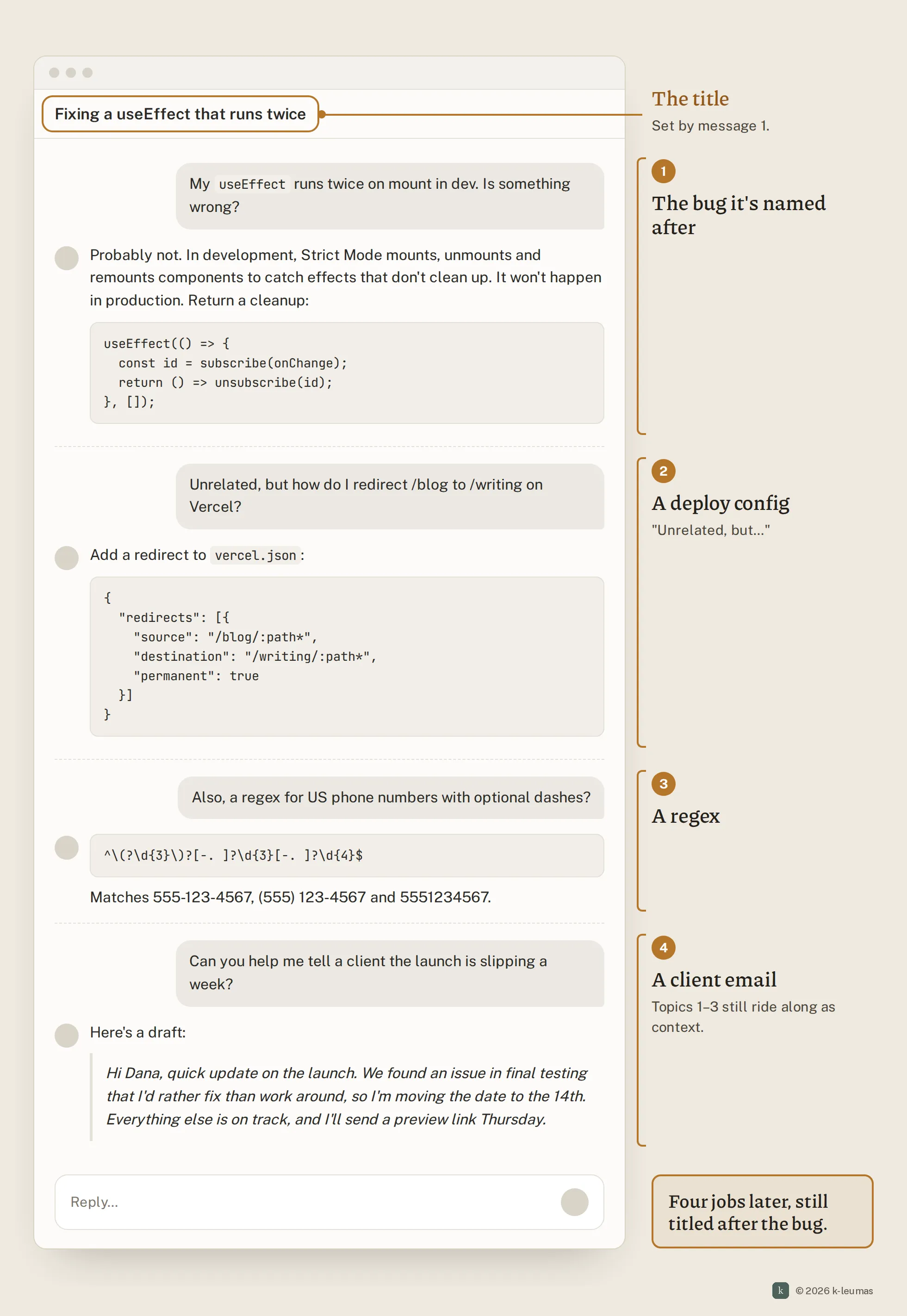
What happens today
- You open a conversation for one task and get a good answer.
- A related-ish question comes up. Starting fresh means a click, a new blank thread, and re-explaining your context. Staying costs nothing, so you stay.
- That repeats. The thread fills with material that has nothing to do with what you’re asking now, and all of it rides along with every new message.
- Answers get slower and vaguer, and earlier details start bleeding into later ones. Afterwards the history is hard to search, because titles describe how a thread started, not what’s in it.
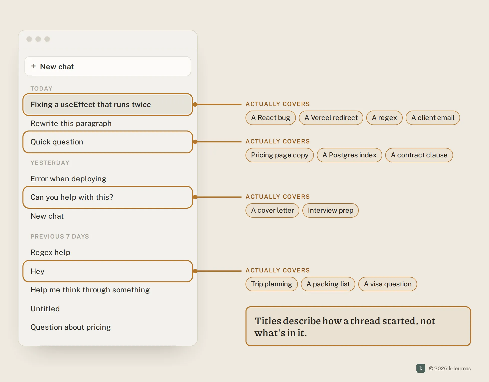
Why it stays broken
This isn’t a missing button. Every chat tool already lets you start a new conversation. The problem is that the interface makes the right thing harder than the wrong thing.
- What the user optimises for: momentum. The context is already in the thread, and the input box is already focused. Staying is the rational choice in the moment.
- What the system pays for it: a longer context on every turn, more irrelevant material for the model to sort through, and a history that’s hard to search later.
- Why nobody feels it in the moment: the cost is spread thinly over many later messages. No single reply is obviously worse, and nothing tells you that your thread has turned into three.
It’s also not the user’s fault. People are responding correctly to the incentives the interface gives them.
A fix
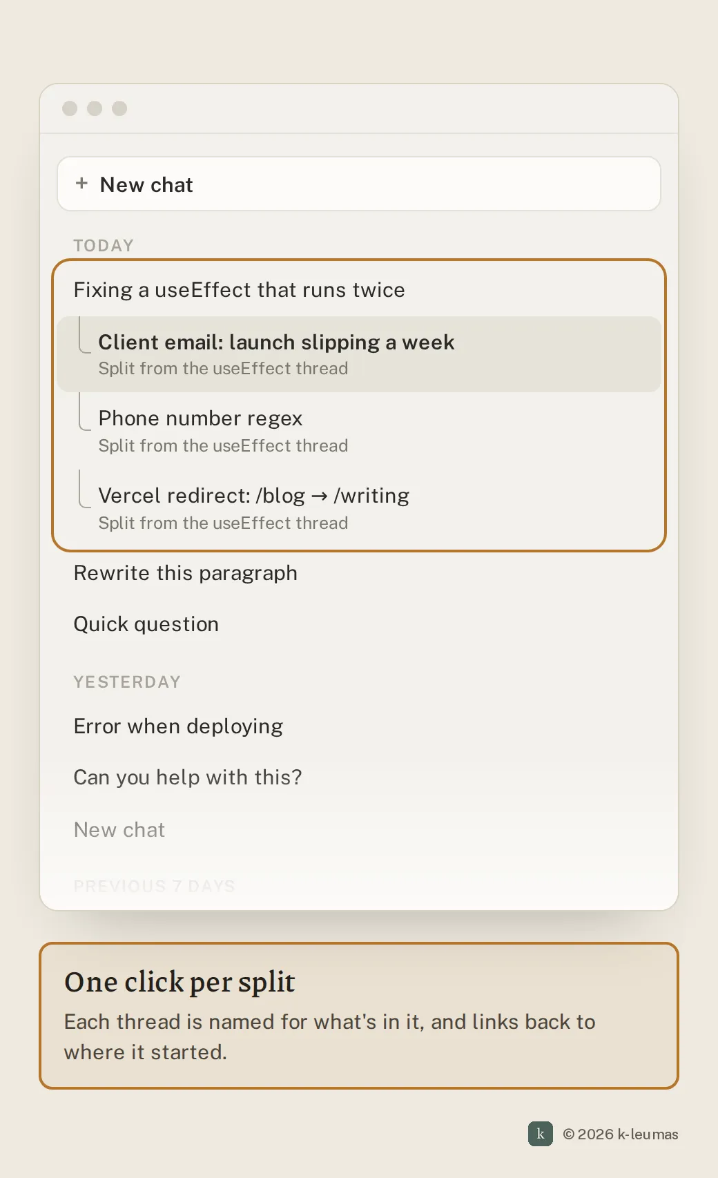
Let the interface notice the topic change and offer to split, with the context carried over, so that starting fresh costs one click instead of a re-explanation.
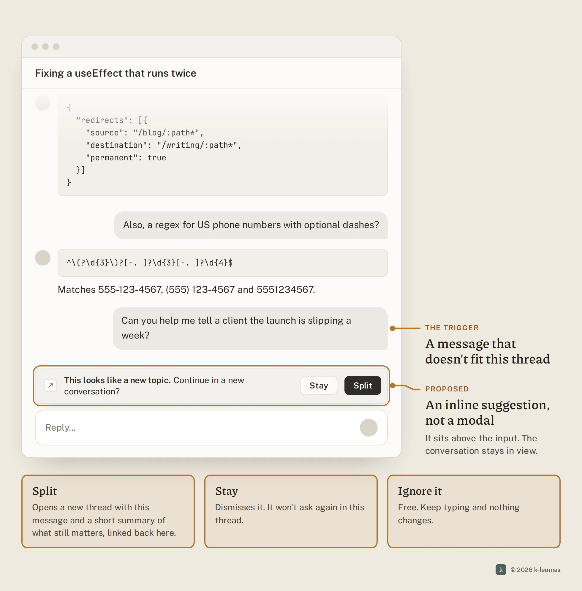
When you send a message that looks unrelated to the thread, a quiet prompt appears above the input. Split opens a new conversation with your message and a short summary of whatever context actually matters, and it links back to the original. Stay dismisses it, and the tool stops asking for the rest of that thread.
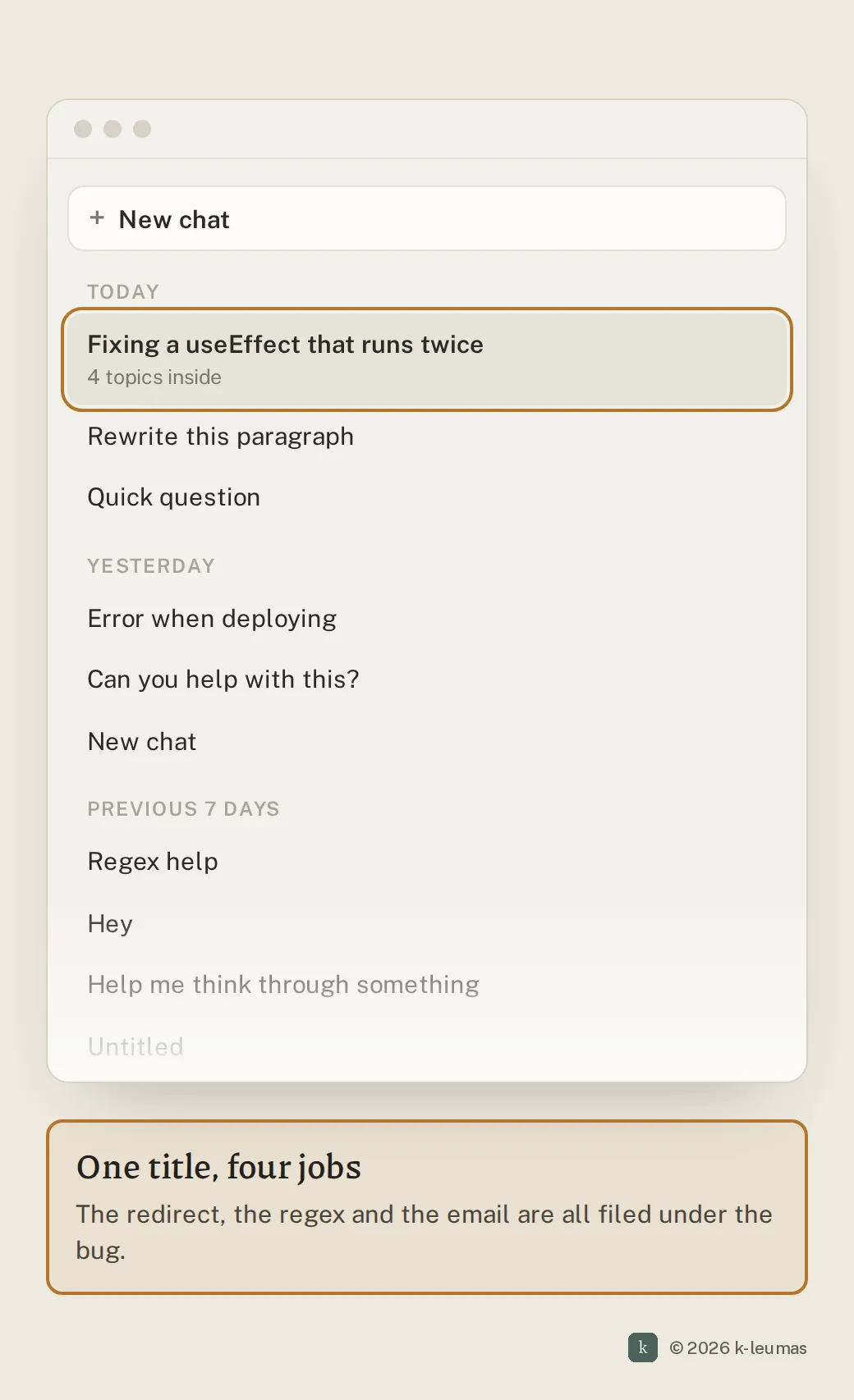
The old thread keeps its focus, the new one gets an accurate title, and you never had to retype anything.
Side by side
How you’d build it
- Smallest version: a “Continue in new chat” action on any message, which starts a thread seeded with that message and an auto-generated summary. No detection yet; it just removes the re-explaining cost.
- Solid version: detect topic shifts from embedding distance between the new message and a recent-thread summary, and show the inline prompt above a threshold. Tune for few false positives; a nagging prompt is worse than none.
- Ambitious version: treat conversations as a graph rather than a list. Topics branch automatically, can be merged back, and history is searchable by what was discussed rather than by title.
Trade-offs to watch: a prompt that fires too often trains people to dismiss it. Carried-over summaries can drop something that mattered, so the link back to the original thread has to be one click away. Measure dismiss rate and how often people jump back to the parent.
Audit your own product
- Does starting a new conversation cost the user more effort than continuing the current one?
- Can users carry relevant context into a new thread without retyping it?
- Does your product ever signal that a conversation has drifted across unrelated topics?
- Do conversation titles reflect what’s in the thread, or only how it started?
- Can users find a specific answer from last week without remembering which thread it was in?
- Do you track conversation length against answer quality, or only engagement?
Why I built a band-aid anyway
This paper cut is part of why I built Etch, a tool for keeping the useful parts of LLM conversations once they’ve sprawled. It helps with the aftermath: finding the regex, keeping the decision, saving the answer worth coming back to. It doesn’t change the incentive that causes the sprawl in the first place.
That’s the uncomfortable part. A tool on the outside has to reconstruct context that the product and the model already have: what the thread is about, when it changed direction, and which earlier details still matter. Even done well, it’s an approximation. The chat product sees every turn as it happens, and the model already holds the context it would need to spot a topic change and carry the right parts into a new thread. That’s where the fix belongs.
I built the band-aid because I needed one. I’d still rather it wasn’t necessary.
Chat is still a young interface for these tools, and a lot of its shape is inherited from messaging apps, where one long thread per person makes sense. Working with a model isn’t like that. The tools will get better when they’re designed for how people actually work with them, not bolted onto how people used to talk to each other.